Self-Service Tech in QSR: Why User Interface May Be More Important Than You Thought

In this article
Share
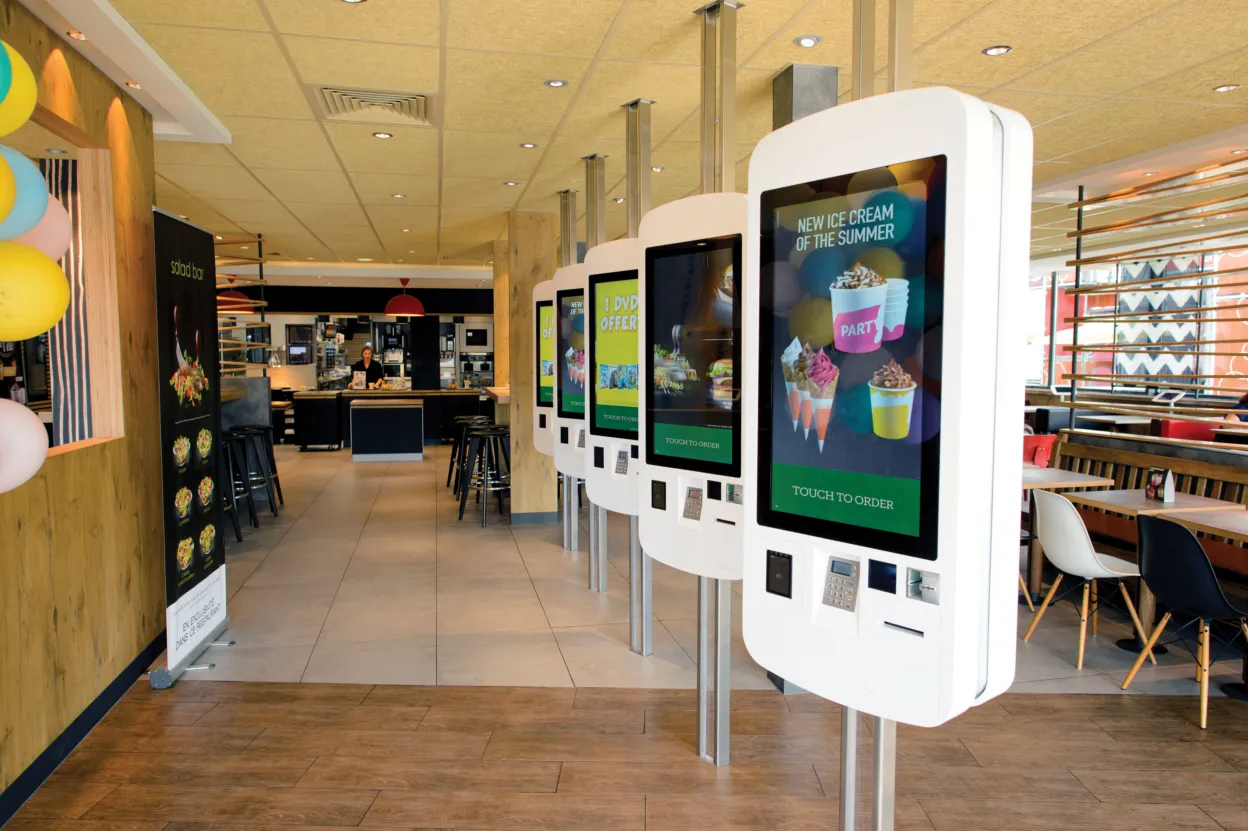
Self-service innovations in the quick-service restaurant (QSR) space, including mobile order-ahead and in-store kiosks, are booming. The self-service kiosk market is expected to reach $30.8 billion by 2024. This ramp-up is likely because these innovative ordering and guest service options have been shown to improve order accuracy, increase average ticket value, reduce wait times and help collect data to inform how to better serve guests. This makes QSRs happy and it also delights the guest (or so that’s the goal). When implemented properly, these new technologies can create a positive and memorable guest experience. However, if it’s not implemented properly, that memorable experience may not be a good one.
While on a recent business trip I made my semi-annual stop at a popular QSR that had implemented self-service kiosks. For years I’ve ordered the same meal the exact same way and have reliably gotten exactly what I expected. With only one register staffed and multiple open kiosks, I tapped the nearest screen and was surprised to find a complicated user interface and to navigate through ordering my meal. Where kiosks often encourage a guest to spend more per ticket while saving them time, I found that I spent more time and less money. I couldn’t find my usual meal, so I ordered a solo sandwich, feeling frustrated and not wanting to invest any more time in the experience. While paying, I vowed not to stray from my uncomplicated “I’ll have a number two,” even if it means waiting in line. (And before you chalk it up to technological illiteracy, my tech-savvy millennial daughter confirmed the experience had been just as frustrating for her as well.)
While my kiosk experience at that particular QSR was an unfortunate one, that’s not the only possibility (otherwise, all of those great benefits I mentioned earlier wouldn’t be so plentiful).
The best way to ensure a positive experience is to be intentional and strategic in your user interface design. Consider these tips:
- Be Consistent. If you’ve taught your guests to operate a certain way that is working for them, opt for a self-service experience that aligns with or complements the experience they’re used to. This way, your guests won’t be thrown off by the different menu style.
- Be Intuitive. If you’re using self-service as a way to improve upon the current experience, organize items and options in an uncomplicated, instinctive way.
- Stay Open to Change. A good self-service kiosk will have analytical capabilities that can help inform how to better serve guests. Put this information to good use by making improvements to your interface as needed. This allows you to better serve guests by keeping up with their changing demands.
- Don’t Bite Off More than You Can Chew. In addition to improving services you already offer, this tech provides opportunities to include new offerings altogether. Before opting for every service, evaluate which options will have the most immediate impact and start there. You can always add more features later.
- Consider it an Addition, Not a Replacement. Self-service is a great tool to help staff manage lines at peak times, but don’t trade your staff for bots. Some guests will have questions, even with the most intuitive self-service experience. Also, think about the family with three small children. Self-service actually slows the process and can frustrate everyone.
- Think Beyond the Kiosk. Self-service isn’t limited to in-store kiosks. Mobile order-ahead fits into this conversation too. Consider whether your environment is best suited to order ahead, kiosks, or a combination of both.
Self-service options have a lot to offer the food and beverage industry, especially when the user interface is developed in an intentional, strategic way. Want to learn more about how it could work for your restaurant? Drop us a line!
Bradford Giles is Senior Vice President of Marketing and Sales Enablement at Ingenico Group, North America


